
Bokay
Bouquet customiztion tool for Family Flowers
Overview
Eddie, are you Bokay?
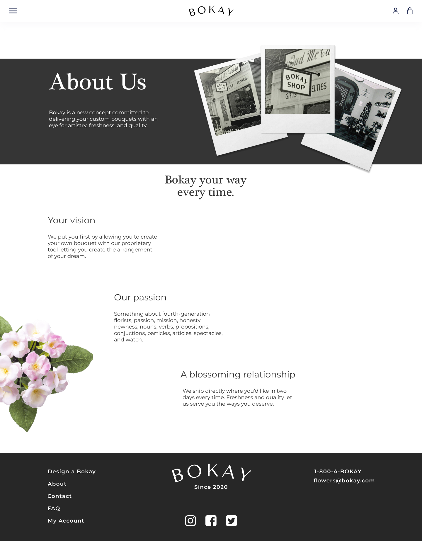
Family Flowers is an online floral business based in Atlanta, Georgia. We partnered with them to develop Bokay: a standalone online application where users create custom floral arrangements with the same Family Flowers standard of exceptional quality and service they’ve come to expect.
Team
John WiseKimia Mirenayat
Cody Quest
Melissa Mokhtari
Role
Research / UX Design
UX/UI DesignUI Design
Brand Identity
Time Frame
6 weeksProblem
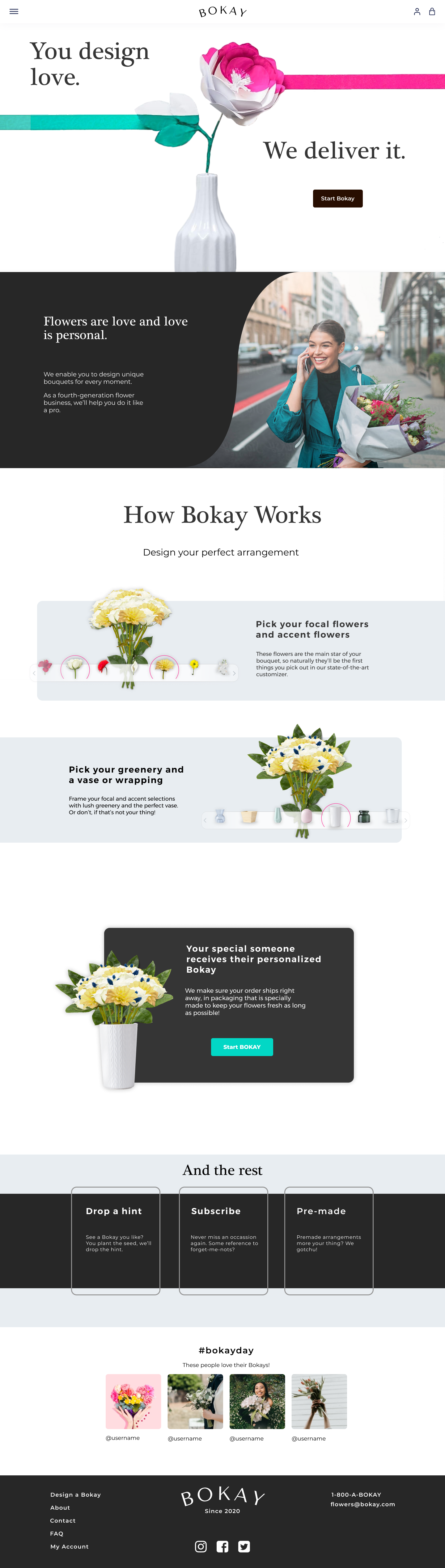
As a fourth generation flower business, Family Flowers was looking to advance their digital strategy and develop brand loyalty among a younger audience by providing a platform where users can create custom floral arrangements.Solution
We wanted to learn more about the current state of the market through research to establish a pertinent solution that adds value to the business. We envisioned a clean and minimal interface that allows the flowers to be highlighted.
Preview of the finished product for mobile

Research
Goals & Objectives
To connect the business objective with the users, we conducted competitive analysis and user research to answer two key questions-
What factors do users consider when choosing a floral arrangement?
-
What are their past experiences and thought processes with online customization tools?
Competitive Analysis
Customization Platforms
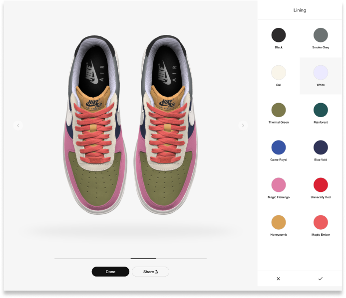
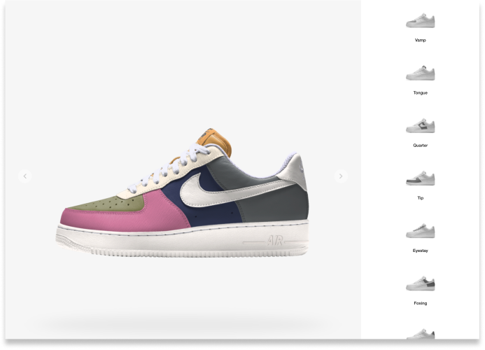
We analyzed three websites with customization features: Nike, Volkswagen, and Buck Knives.-
Nike’s sleek design put the product at the center of the experience
-
They all divided the customization process into a step-by-step approach
-
Volkswagen and Buck Knives lack of visual organization led to confusion
- Nike Provided intuitive tools that were graphically driven


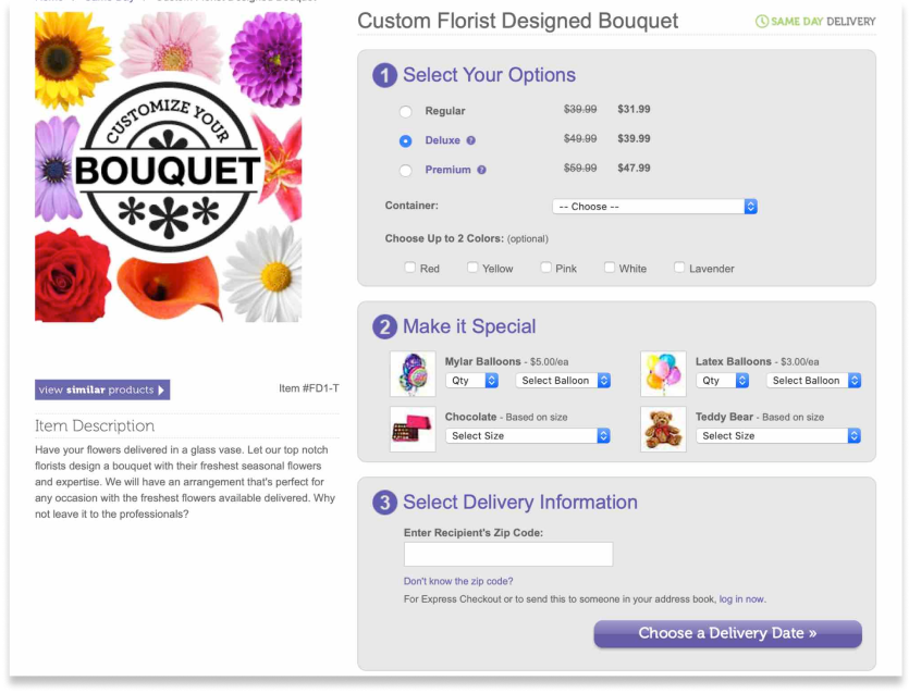

Online Florists
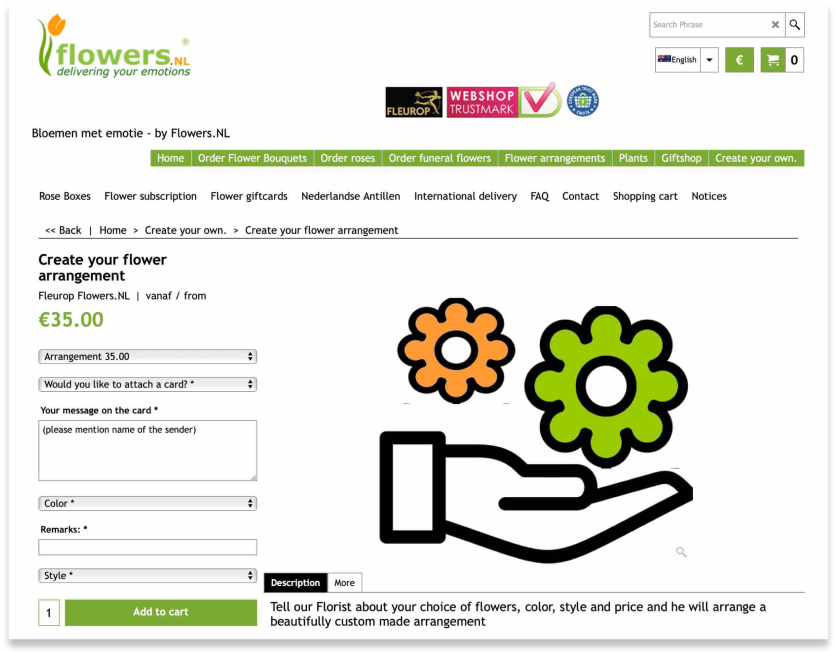
We found a limited number of online florists who offered custom flower arrangements like FlowerCompany.CA, From You Flowers, and Heart & Thorn. None of these sites allowed the user to visualize their selection.- Dated aesthetics
- No pictures of the different types of flowers
- Unable to visual the bouquet step-by-step
- Lacked sufficient customization options
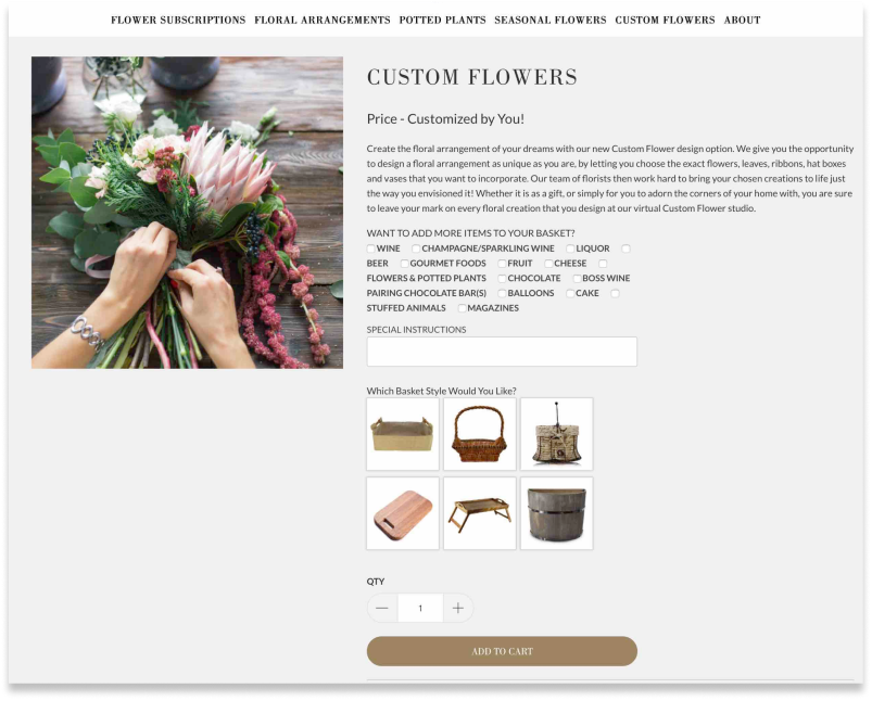
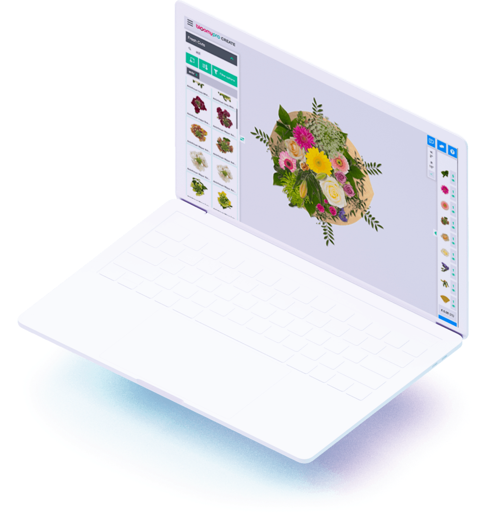
Bloomy Pro
Bloomy Pro is a B2B software solution for industry florists to make flower arrangements virtually and control their inventory. BloomyPro offers plenty of options, however, with more than 3,000 flower options and in-depth features like spacing, it was far too complicated for the average user.
- Beautiful aesthetics and visuals
- Too many options lead to confusion
- Complicated interface
- Exclusive to businesses and not for direct to consumer use
Interviews & Surveys
We conducted surveys and interviews with people who regularly or recently both purchased flowers online and in person and had used customization tools. We used the data we gathered to develop insights into what pain points the user had and what was beneficial for them throughout the processes.

6 User Interviews
47 Survey Responses
Affinity Mapping
We used our insights to create affinity maps in order to understand our user data better and develop concrete insights.
User Insights
Our Findings
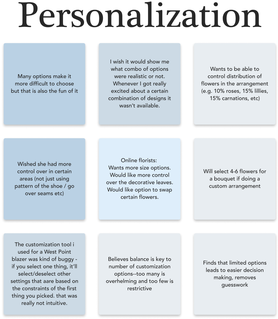
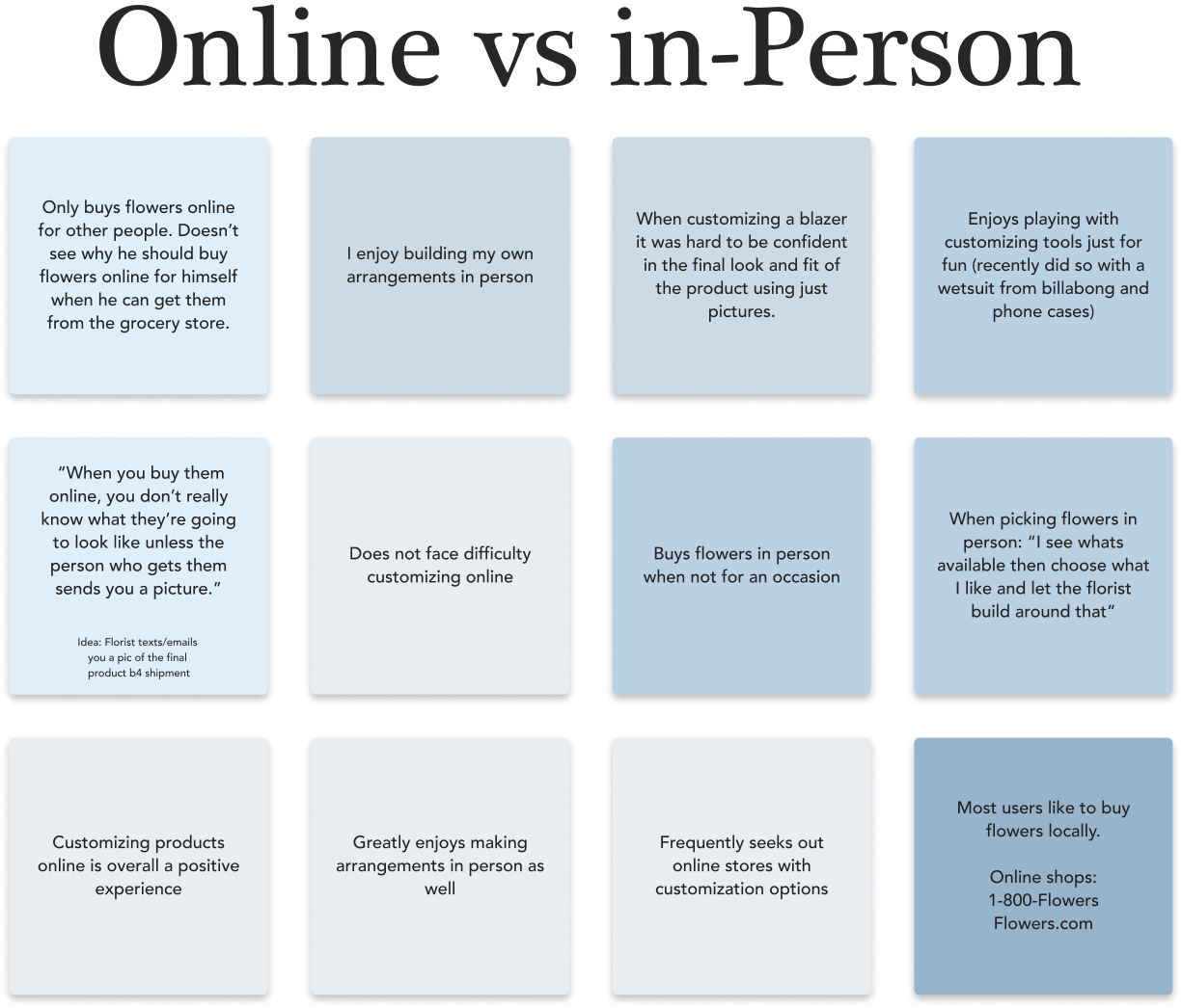
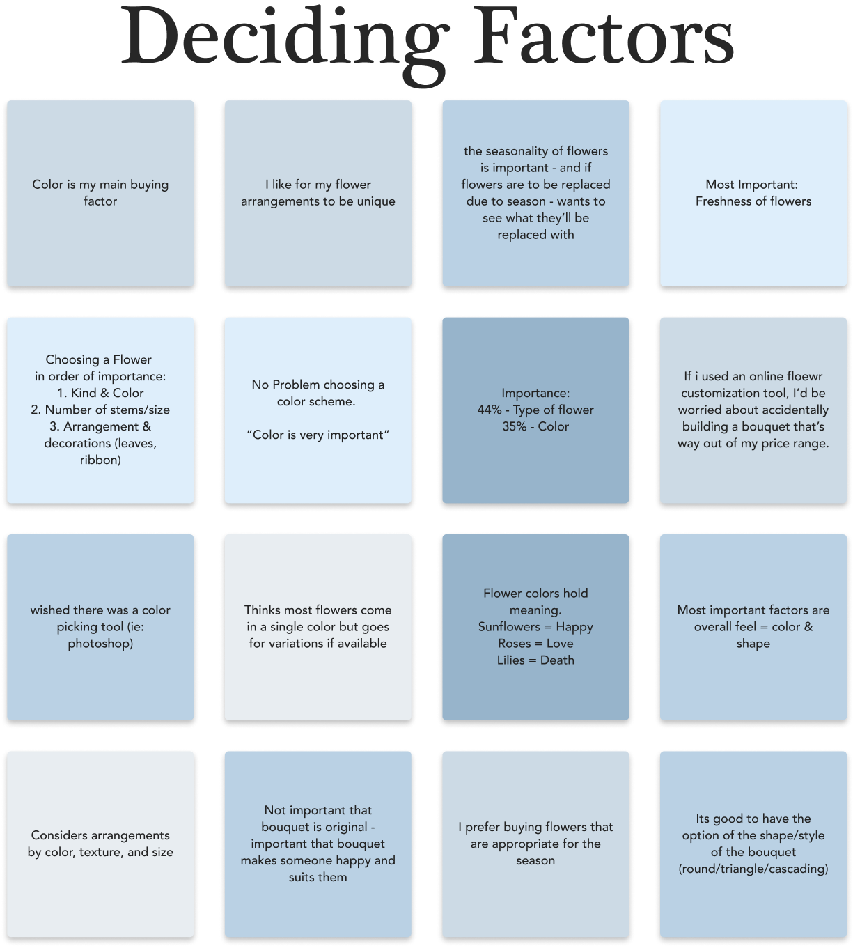
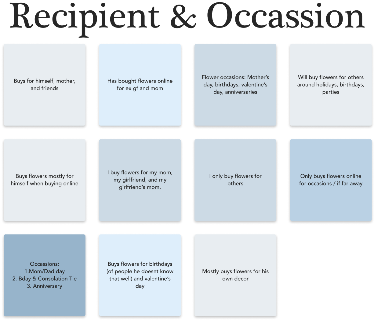
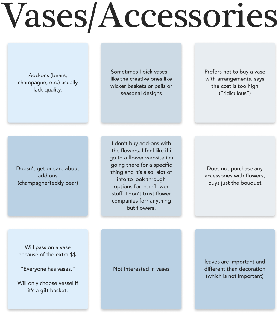
We synthesized the data from our user interviews and survey and learned some interesting findings that helped guide our decisions.-
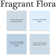
Users showed disinterest in add-on accessories like teddy bears due to perceived lack of quality and value.
-
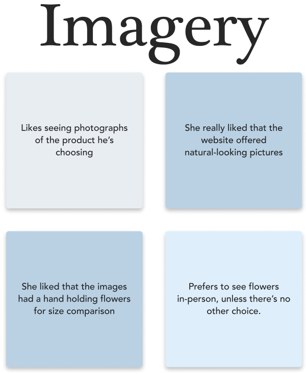
Users needed the images to be representative of the final product. The quality of photography and visuals were essential to gaining the users’ trust
-
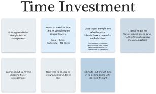
Striking a balance between too few and too many options in customization was vital to making the user feel comfortable and not overwhelmed
- The customization tool’s interface needs to be simple and neat so users can focus on completing the task in each step
Ideation
Sitemap
As Bokay’s concept is on custom creations, the site map was able to stay very simple. We have a few subpages to help users and tell them a bit more about the company, but the primary focus is on the tool.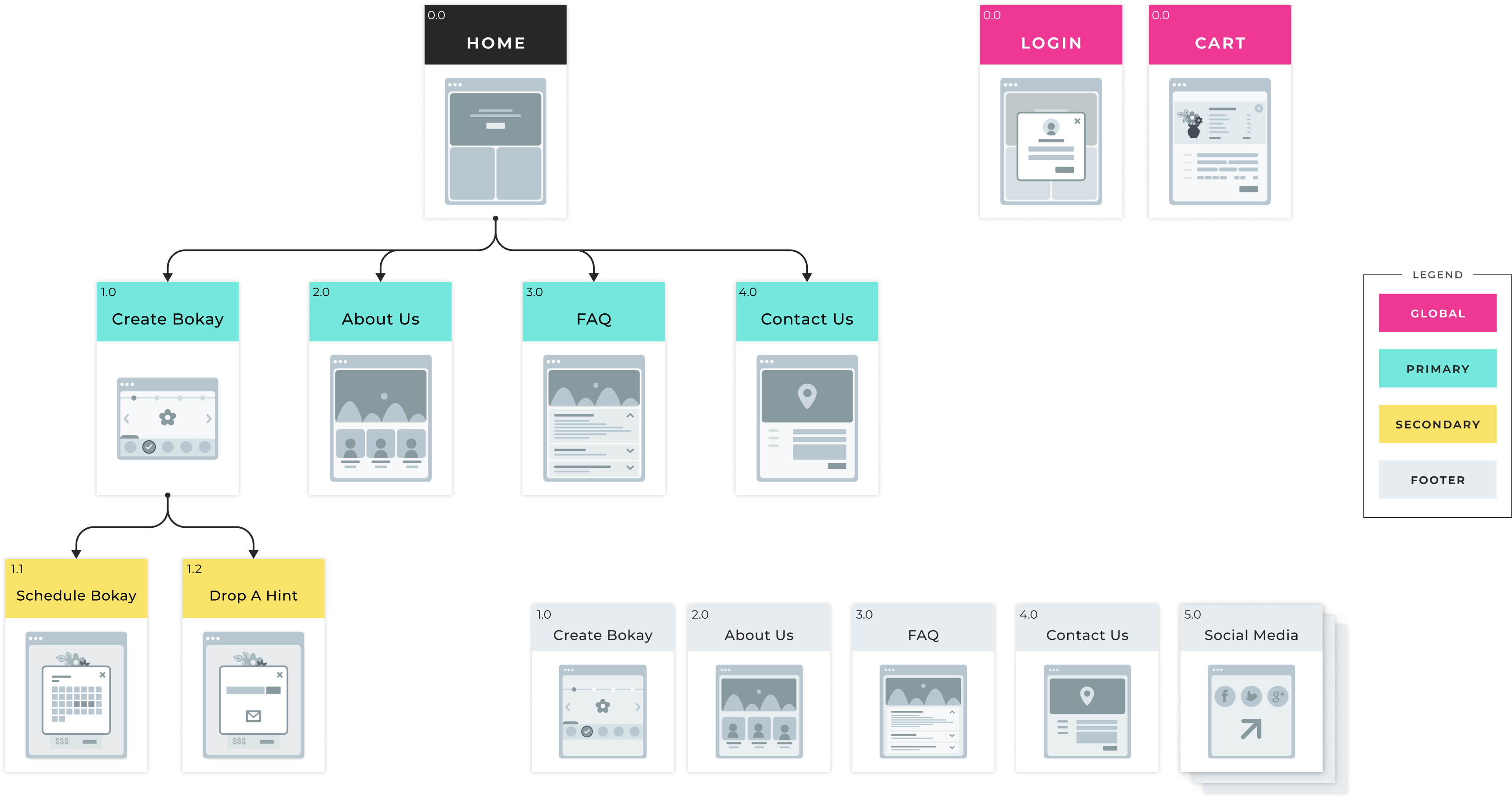
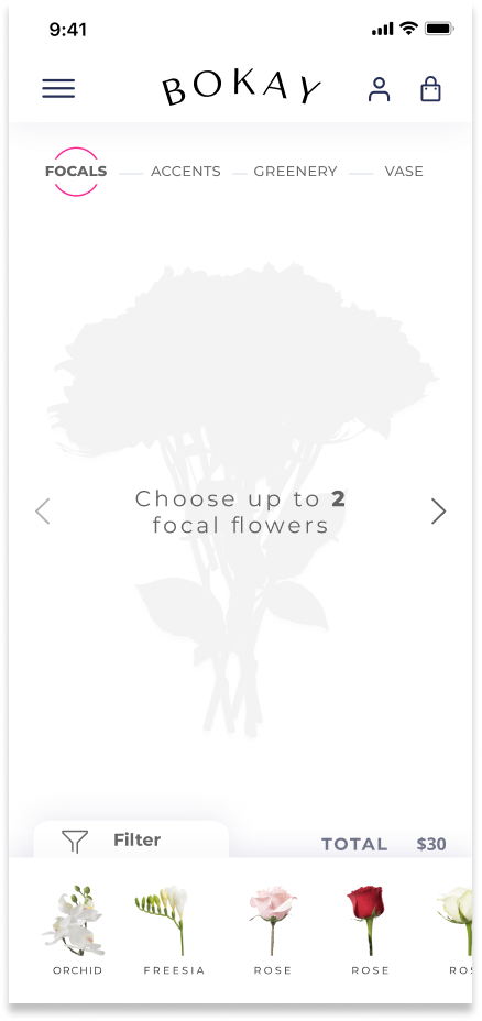
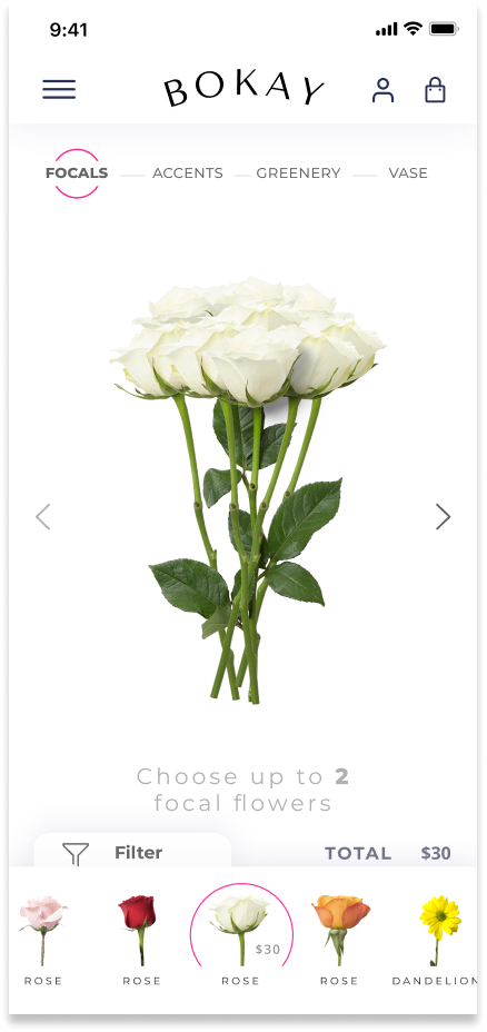
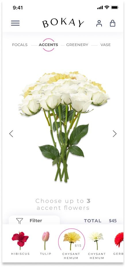
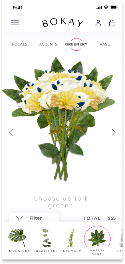
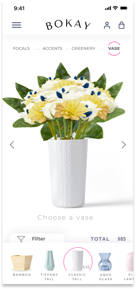
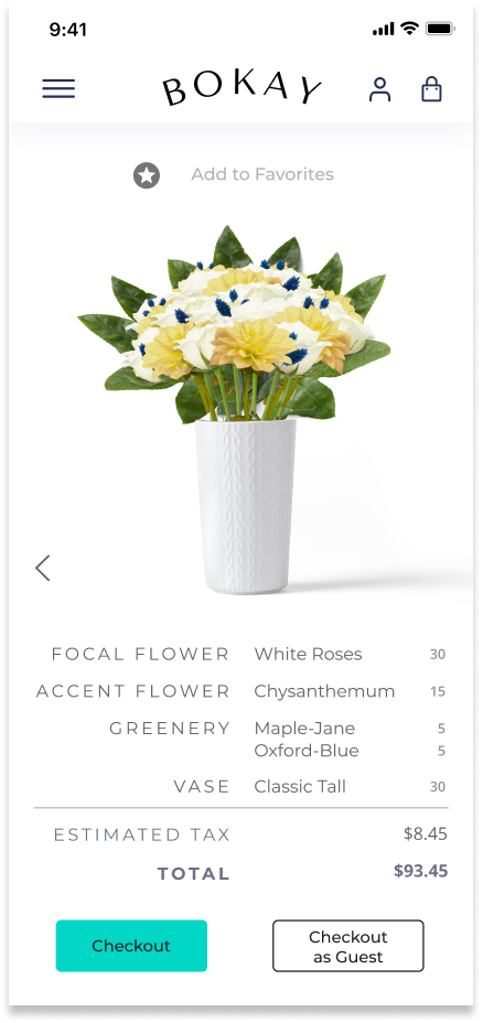
Step by Step Flow
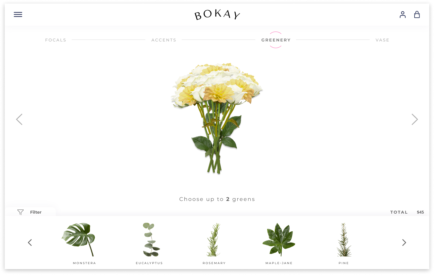
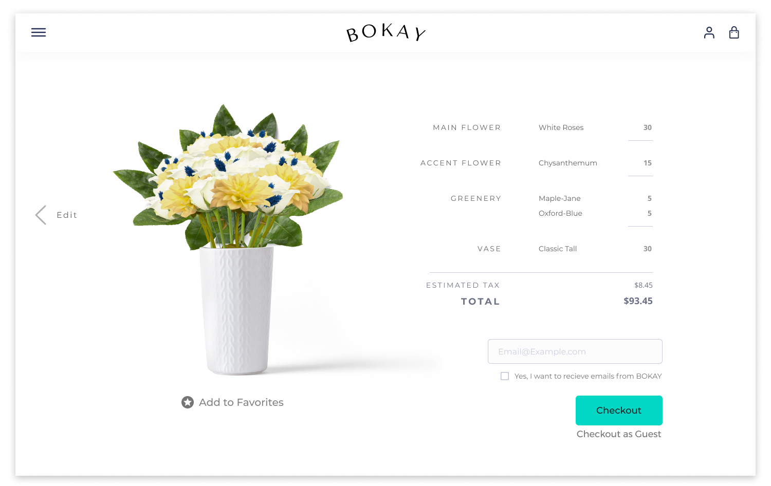
We knew we needed a simple sitemap that would guide the user to the customization tool. To establish a path for our users, we had to do some research to determine how florists create a bouquet. After studying different methodologies and speaking to the stakeholder, we settled on a four step process that encompassed a bouquet. The process begins with the user choosing their main or focal flowers. Next, they choose their accent flowers, the greenery or foliage, and finally, the vessel.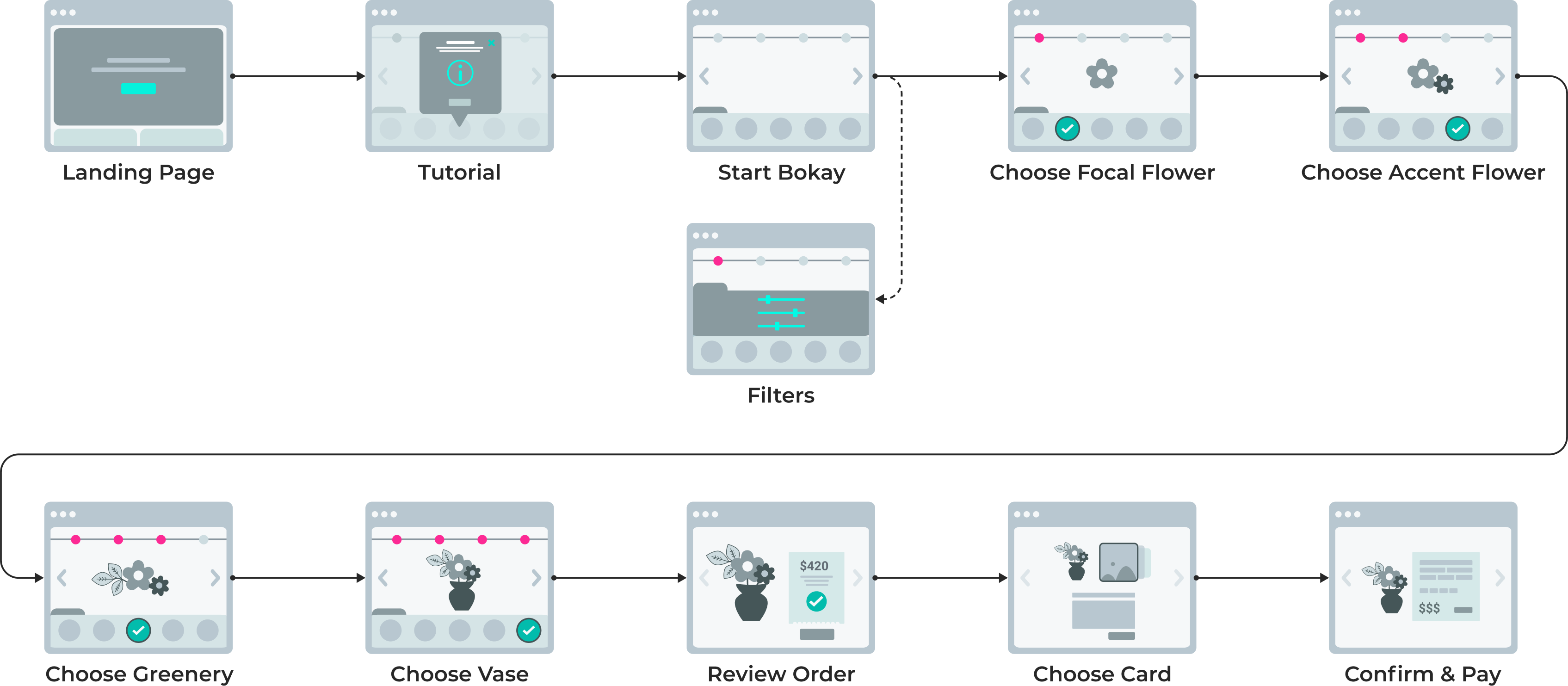
Wireframes
The Blueprints
We had to start the design process by focusing on the customization tool. We knew it would be the primary focus of the site, as well as the most complicated aspect of our work. When designing the wireframes, I was mindful to leave enough white space so the flowers could stand out, and leave ample room for the different features, like the selection panel and the breadcrumbs. We used these wireframes to create the first version of the tool.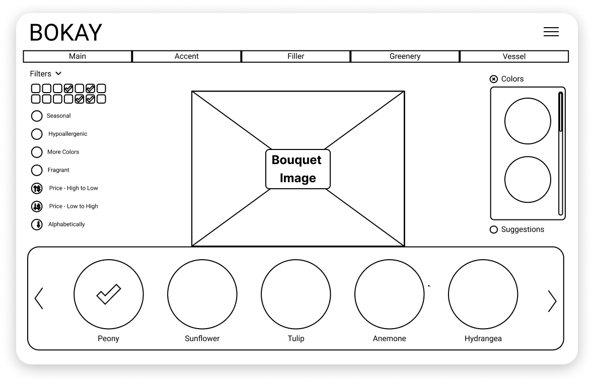

Style Guide
The Bokay Aesthetic
After revamping our first version of the homepage, we compiled a style guide to direct us in designing a cohesive final product. We chose a font like Patchi Patchi to add a playful look. We used visual assets like paint strokes to convey customization and artistry. An added embossed background adds texture and depth to our design. Although bright colors can sometimes be too distracting, we utilized white space to allow important content and imagery to stand out.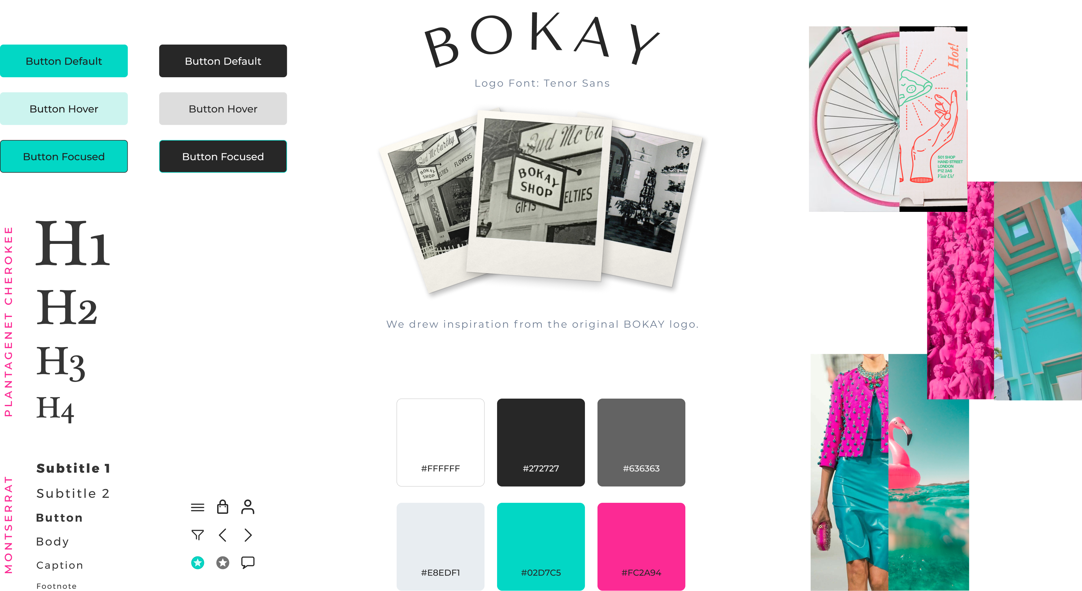
Product
Iterations
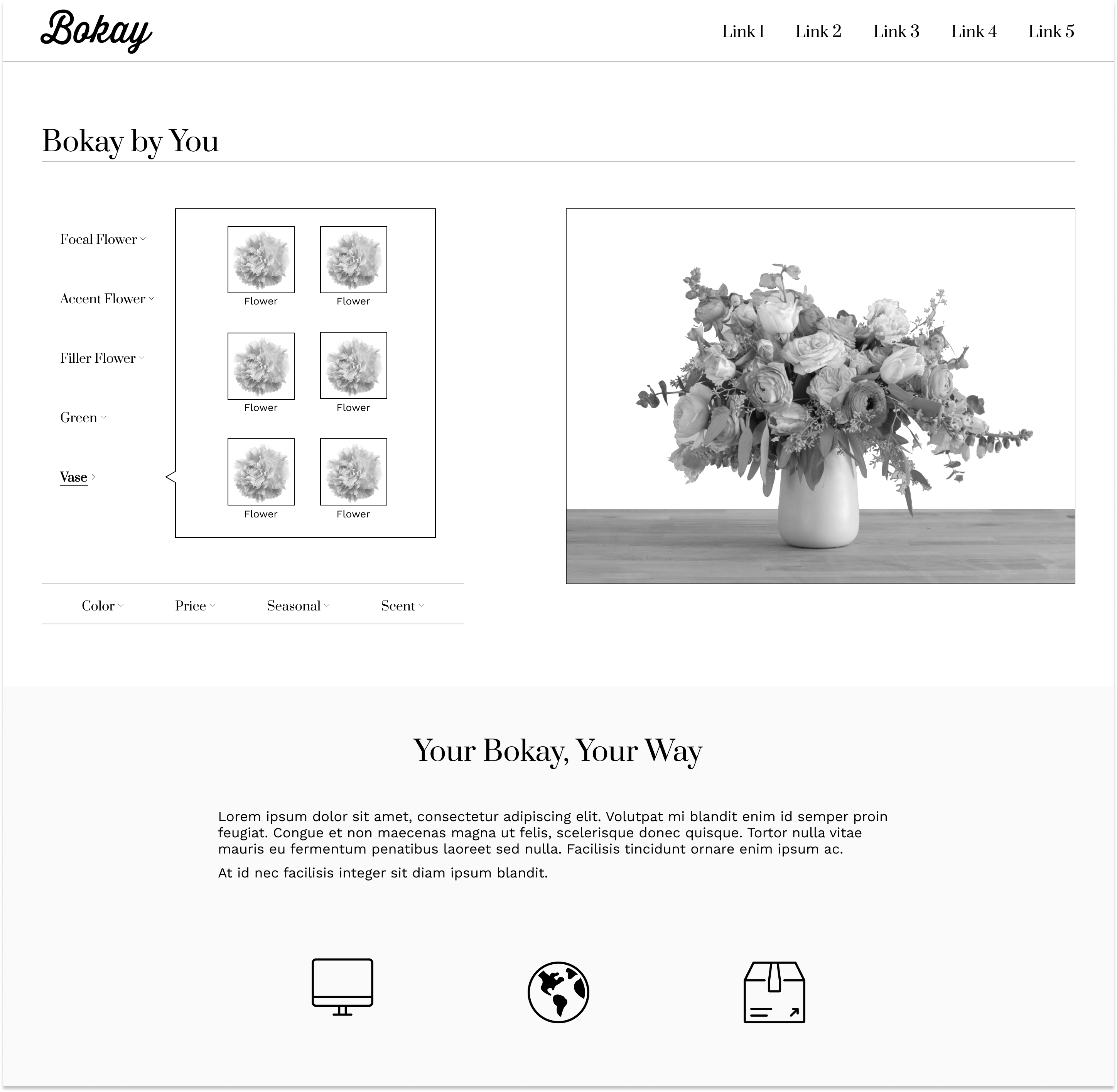
Using the wireframes, we worked on designing the first version of the tool. We used this version for our first round of user testing. We wanted to start identifying and resolving any usability issues promptly so we would have ample time to fine-tune the customization tool.Mobile Tool
Desktop Tool
Tutorial
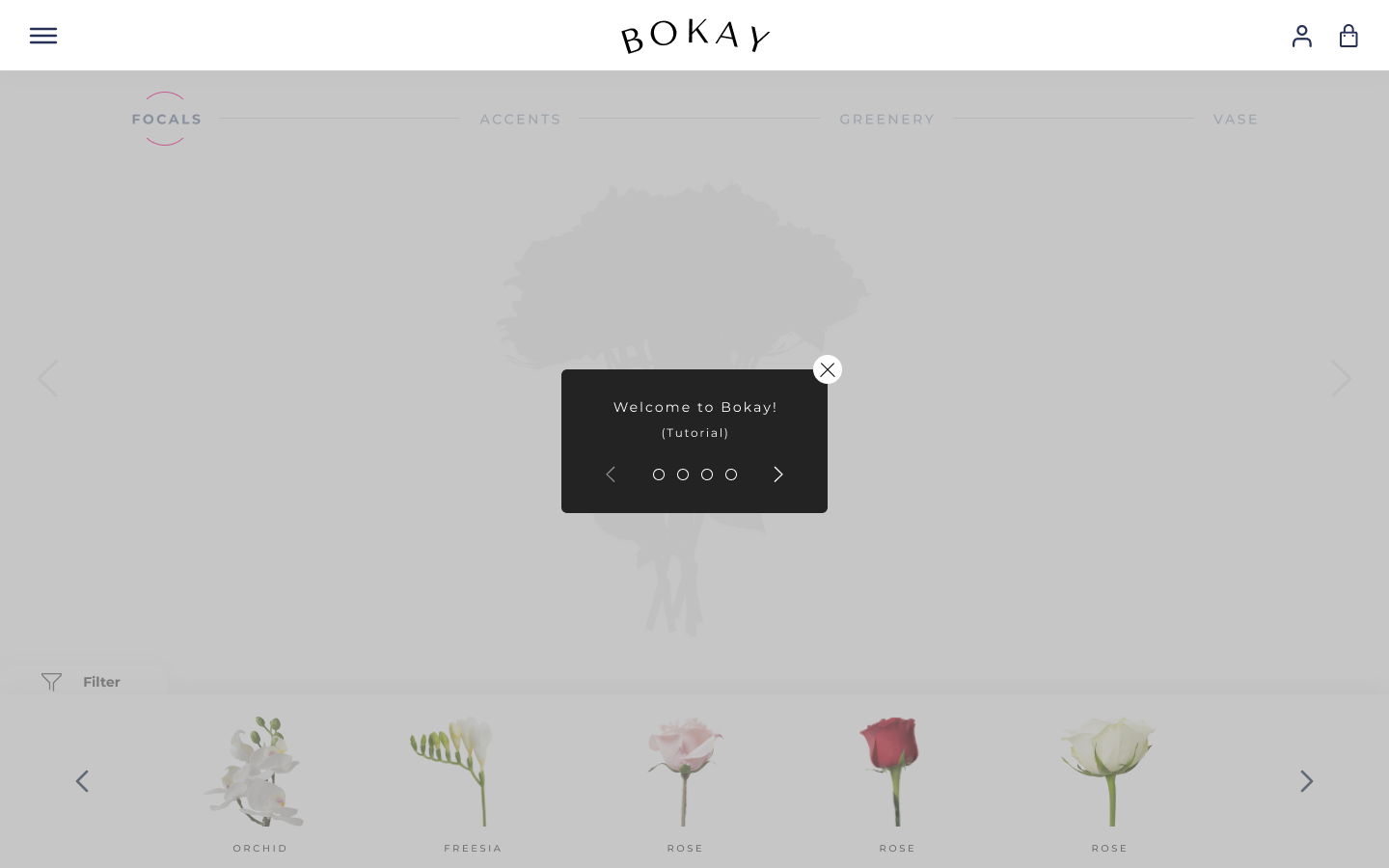
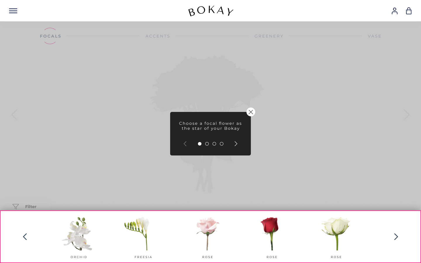
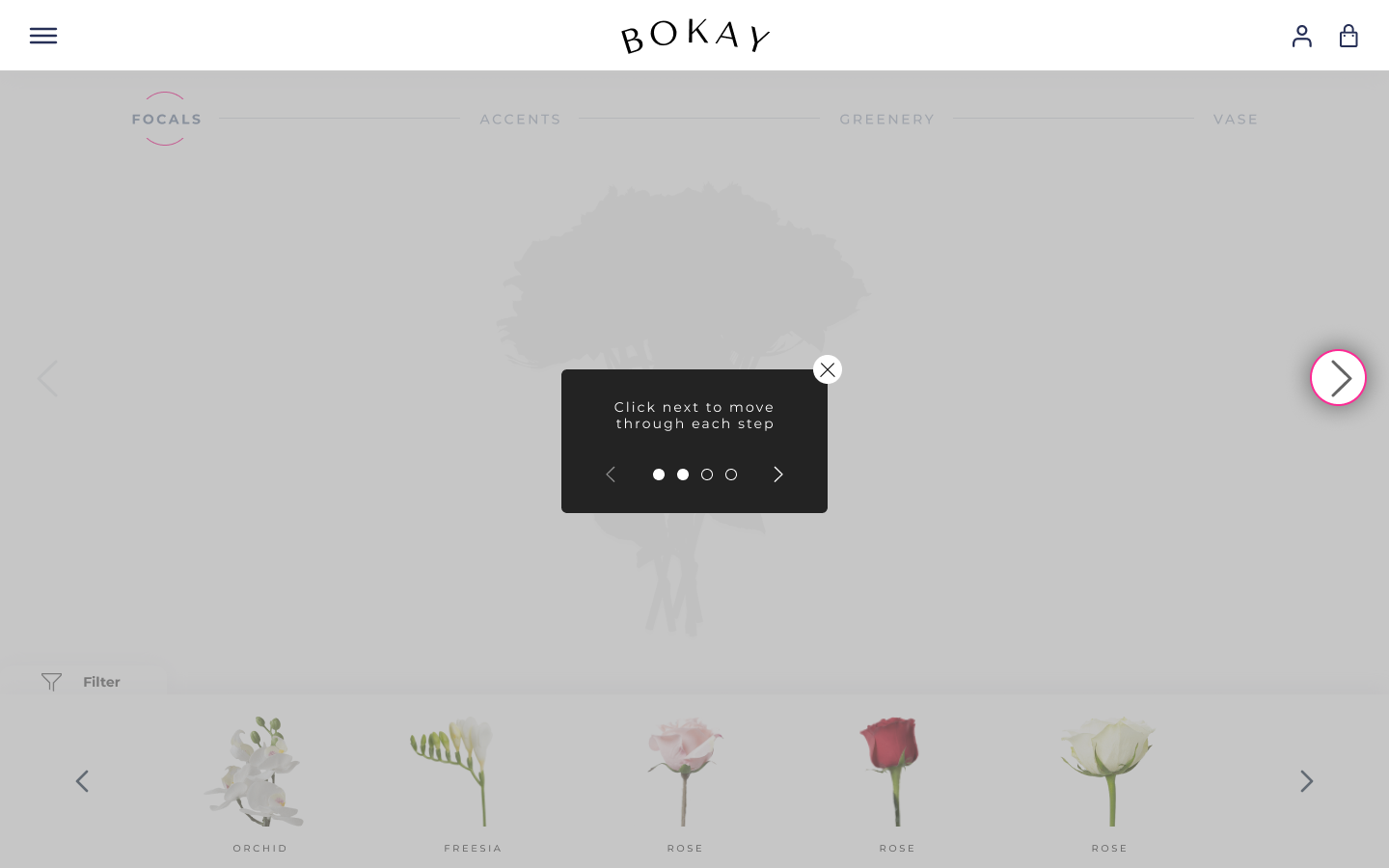

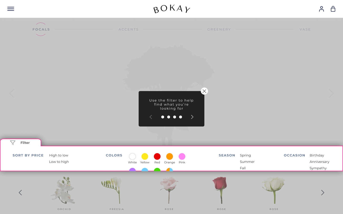
Tool
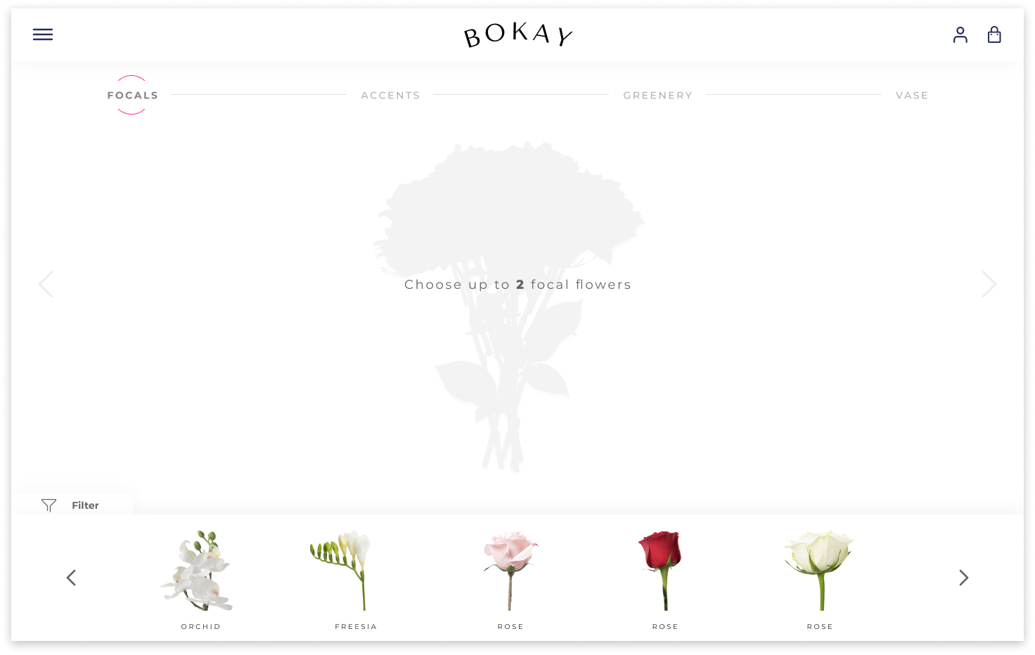

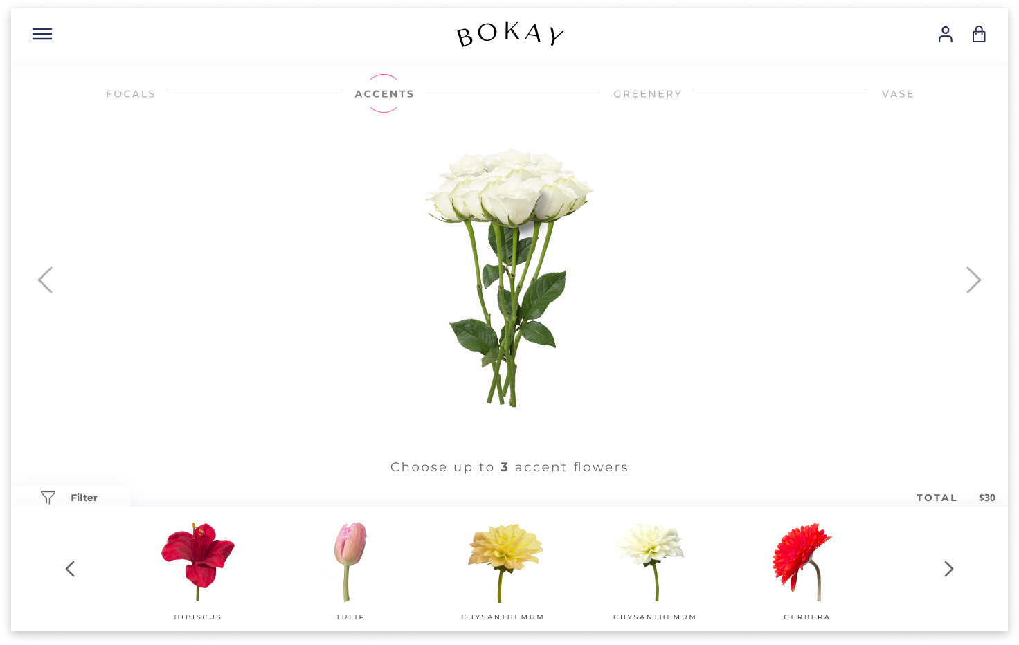


Desktop Site
Final Thoughts
Lessons Learned
We are really excited for the launch of Bokay in late 2021! I had an amazing time building the various functions of the tool and developing the brand identity. Having worked with a stakeholder for the first time, I learned to be flexible and try to see things from a different perspective.Our key takeaways from this project are:
- Set constraints to keep the ideation process manageable.
- Test even the smallest of changes as they can have a huge impact on usability
- Disconnect your familiarity with your design, keeping in mind the UX motto, “you are not the user.”