
California DMV
User interface and information architecture redesign
Overview
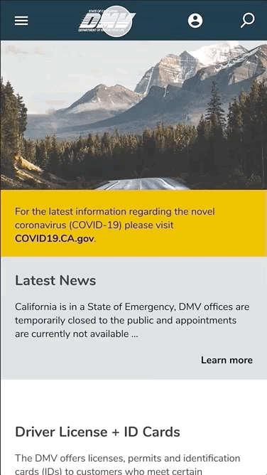
Problem
A confusing structure and overwhelming amount of information makes the CA DMV site difficult to use. The interface is also dated and could use some freshening up.Solution
Reorganzing the site to be more modern and welcoming while reorganizing the information architecture to be more welcoming. Team
John WiseRole
UI Designer & RebrandingTime Frame
4 weeksHattie Chau
UI Designer & Information Architecture
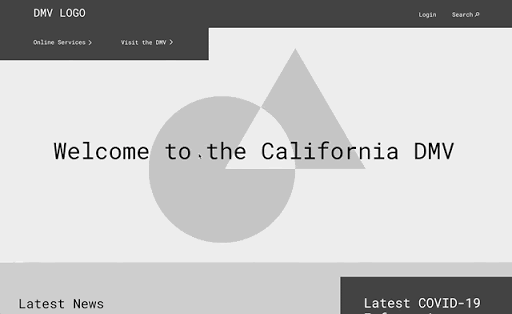
Preview of the final product
Research
Goals & Objectives
In order to design a new version of the DMV’s website we needed to analyze the current site to understand what the pain points were and how to best redesign for the user’s experience.Analysis
User Path
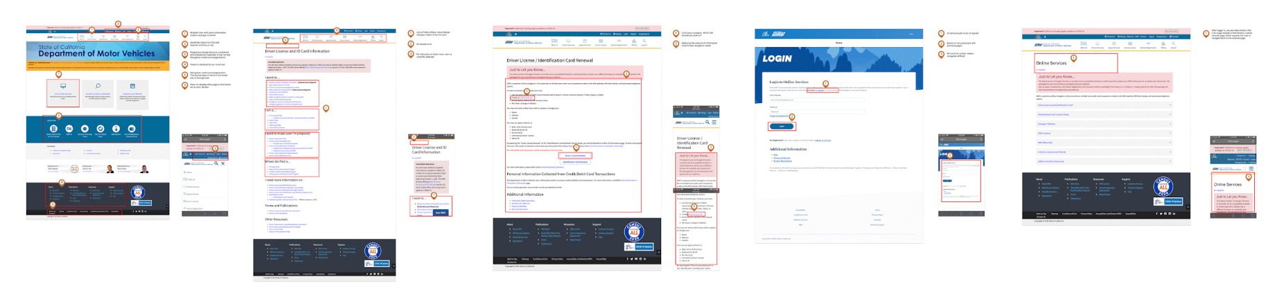
Going through the typical user path, it was easy to see why people came away from the DMV website with a bad impression. It had to many steps and too many links.
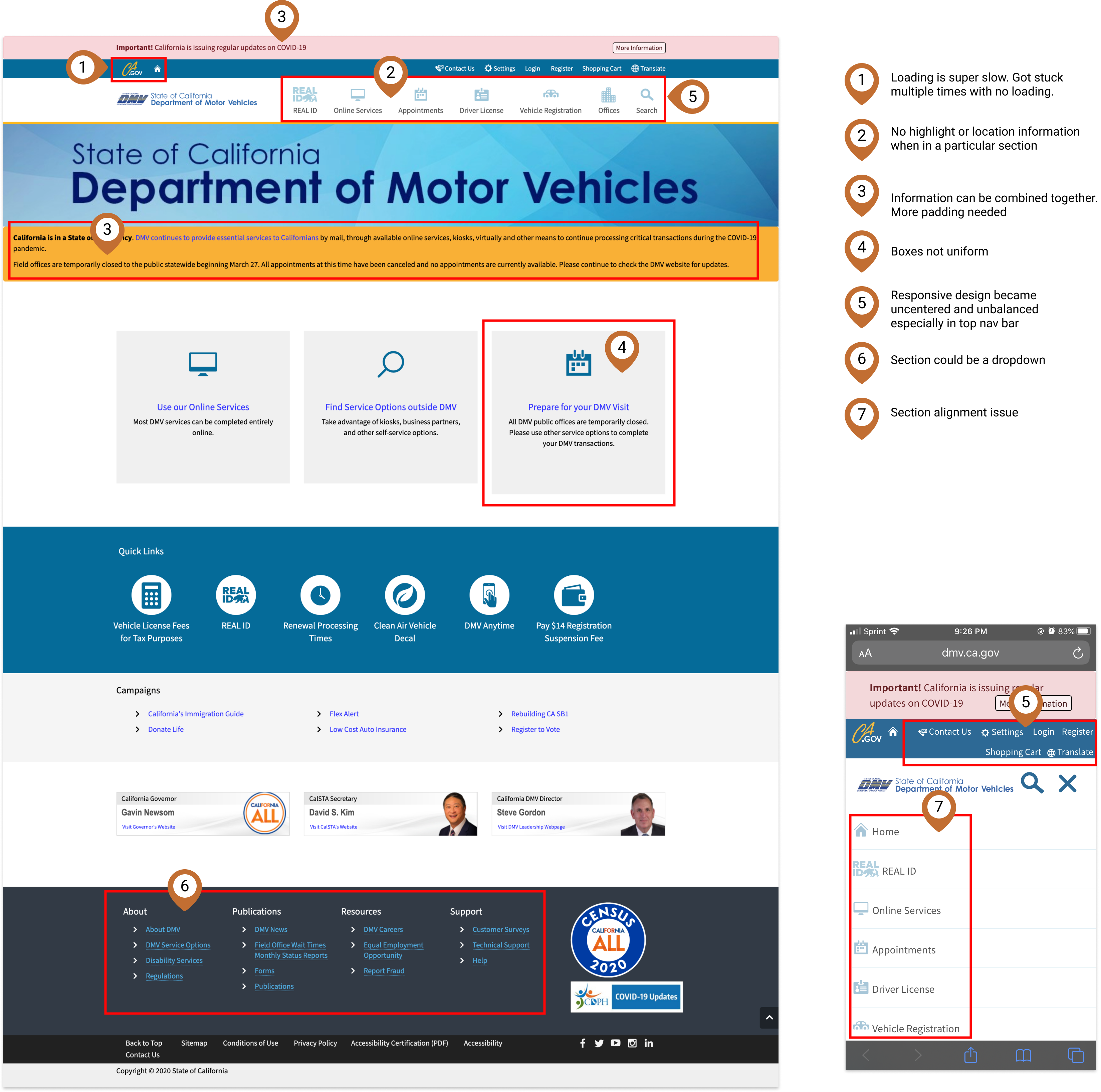
Heuristic Evaluation
We started our redesign process by doing a heuristic evaluation of the DMV website where we evaluated the website based on the appearance, content, navigation, and efficiency.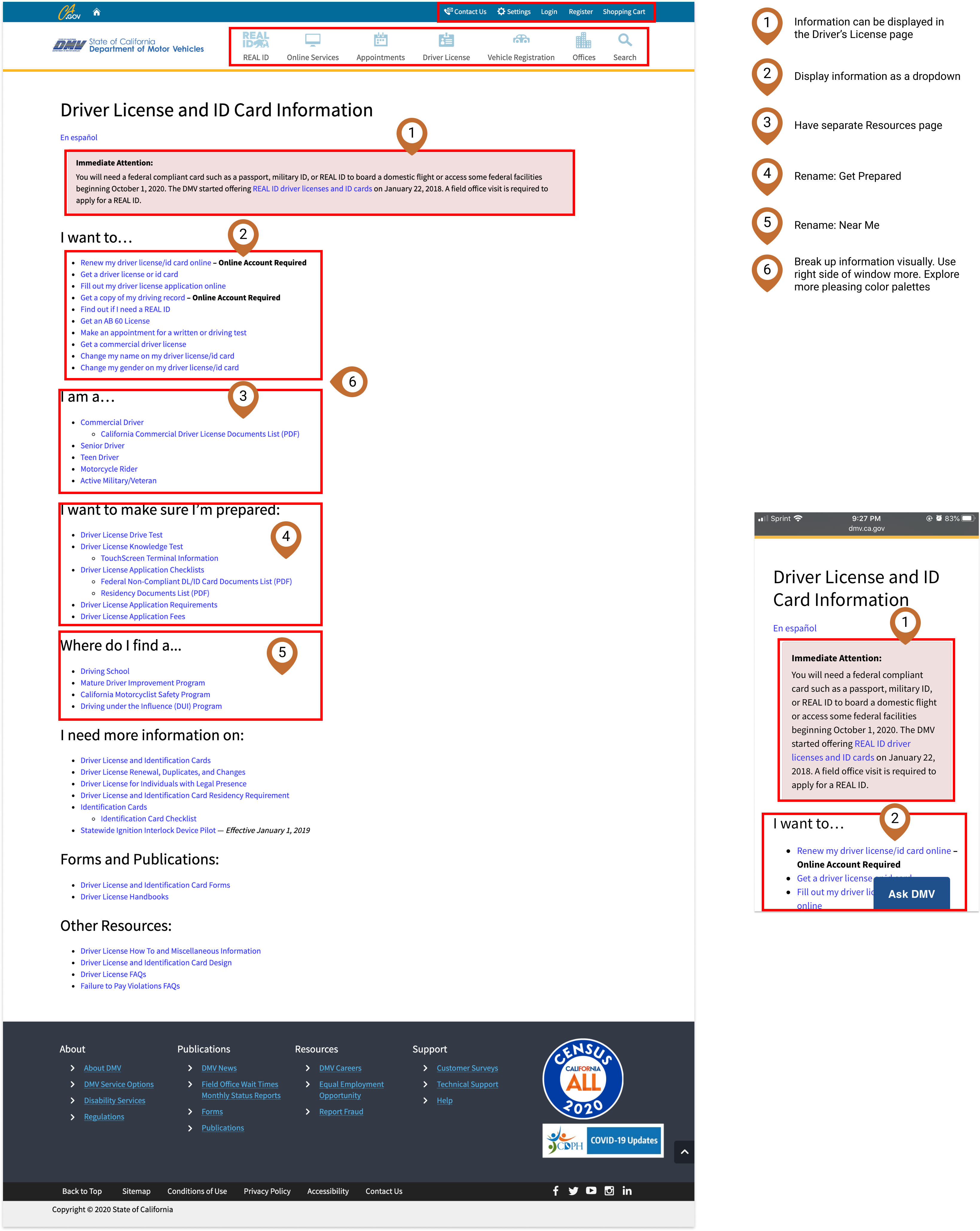
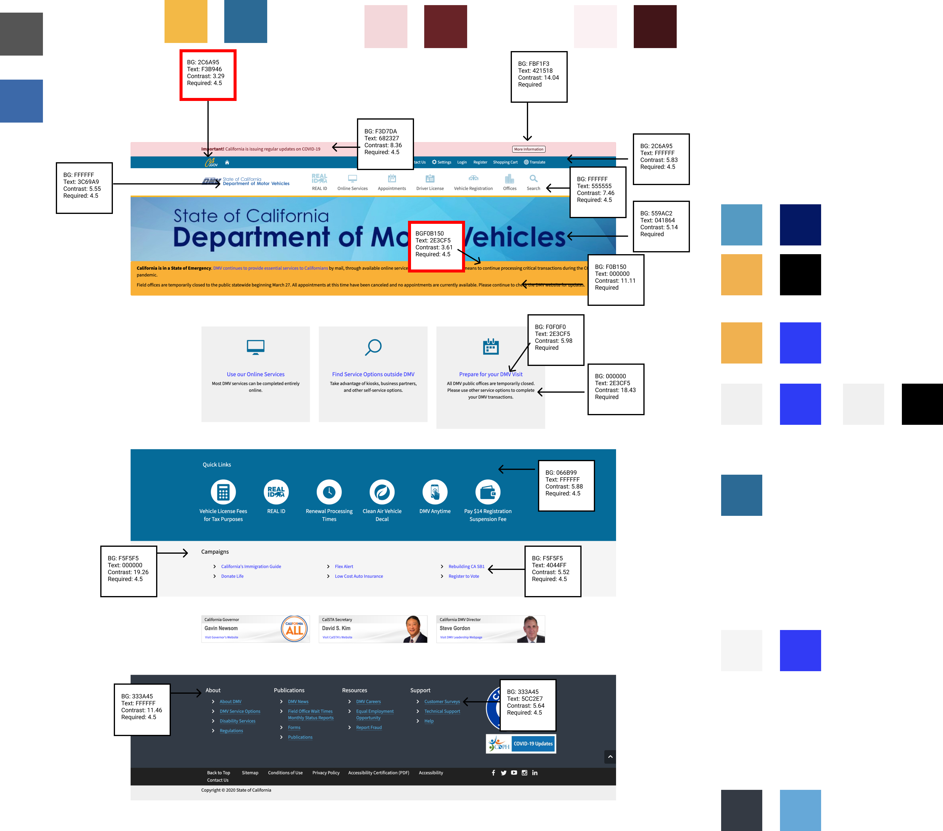
Color Accessibility
The color accessibility on the DMV website was actually pretty good. We only found two instances where the color contrast could be improved which are marked in red.Usability Tests
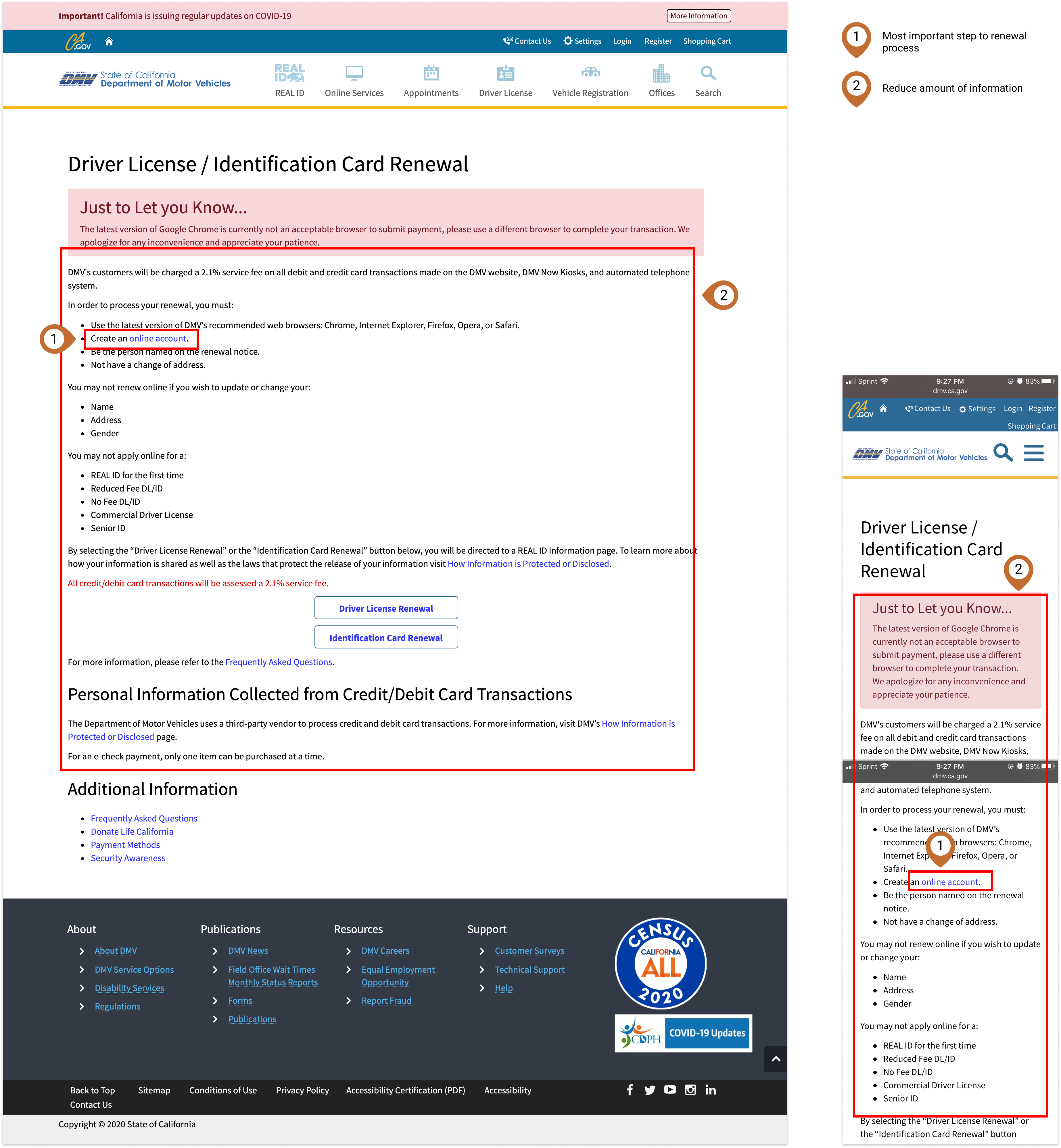
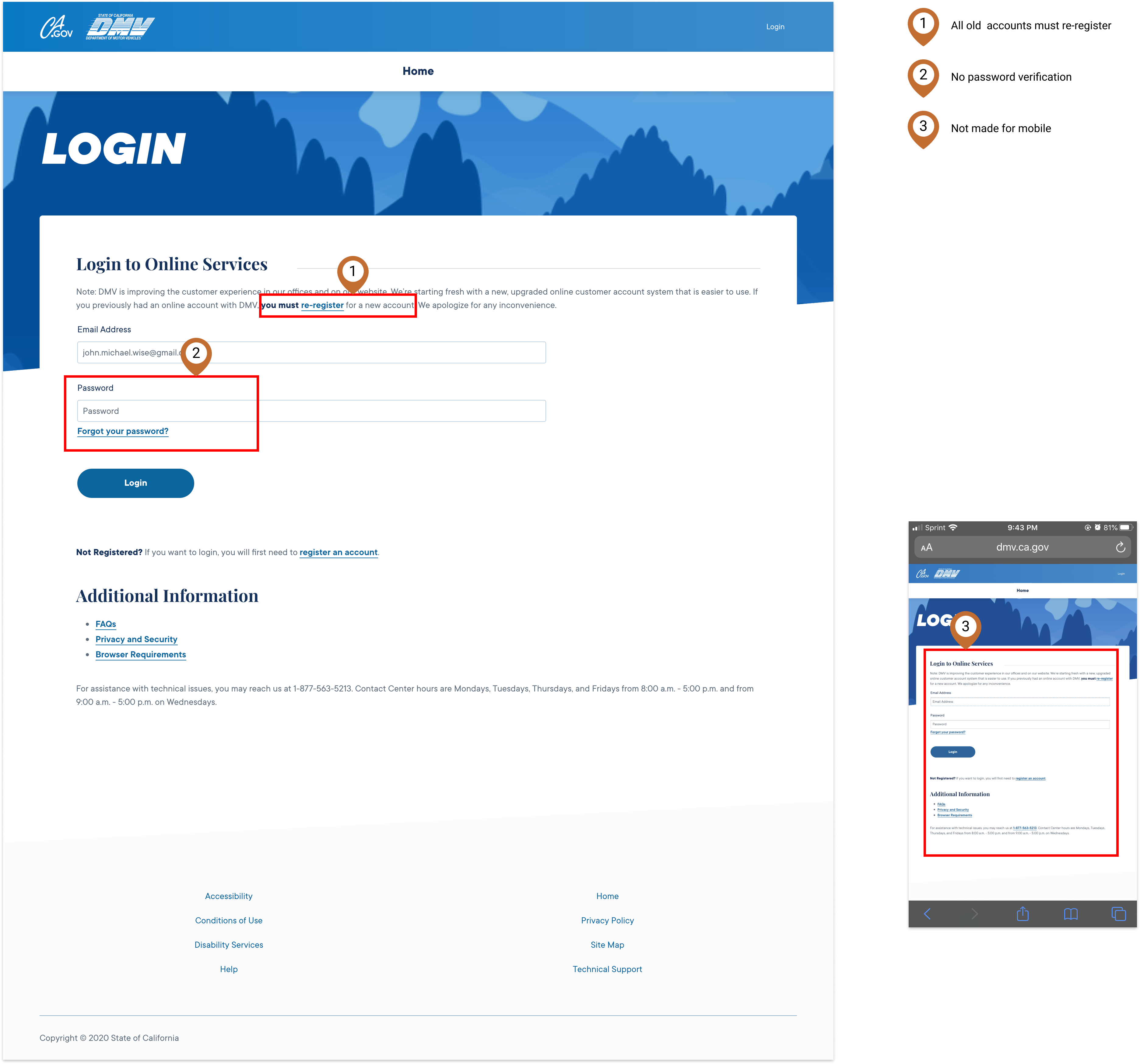
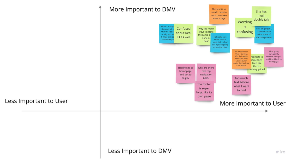
After conducting our usability tests and reviewing our notes, we found a number of similar complaints with multiple users like confusion over the convoluted website and frustration with the unclear terminology.

2x2 Matrix
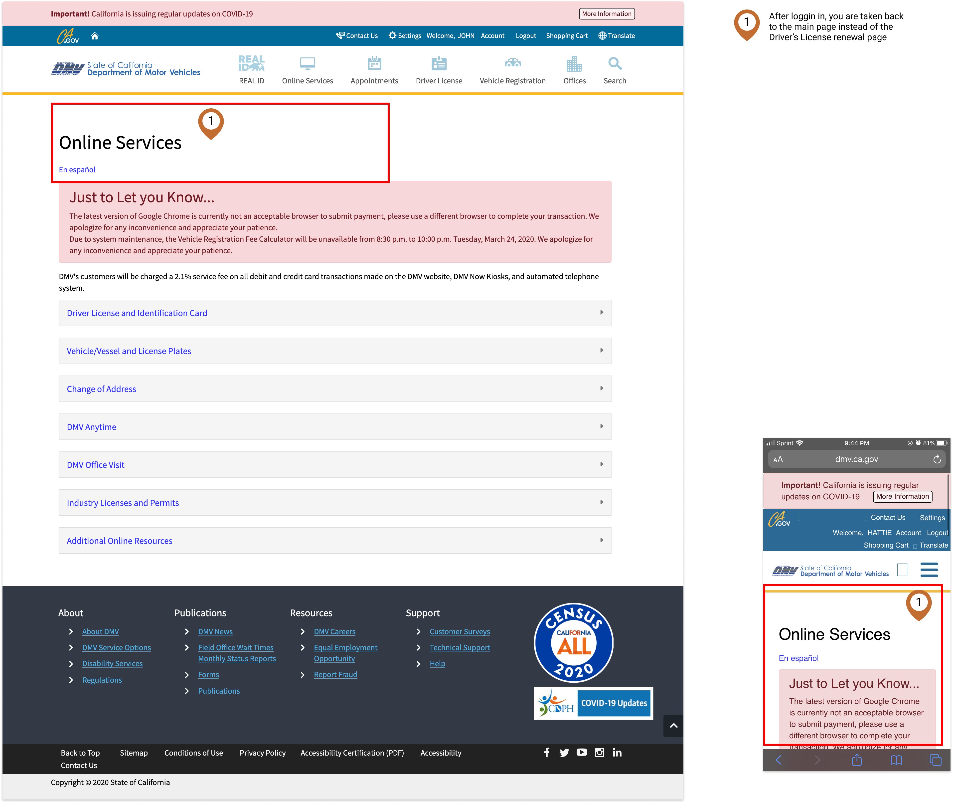
The main issue we found with the DMV website was that it was generally unclear and difficult to use. This included not being able to login, being redirected to unexpected pages, and having primary flows buried inside mountains of links.Information Architecture & Navigation
Navigation
Navigation Usability Tests
From our usability tests, we found that users had common pain points of not knowing how to navigate to where they wanted to go, website redirects that made the user feel like they were repeatedly doing the same tasks and text links that took too much time to read and understand.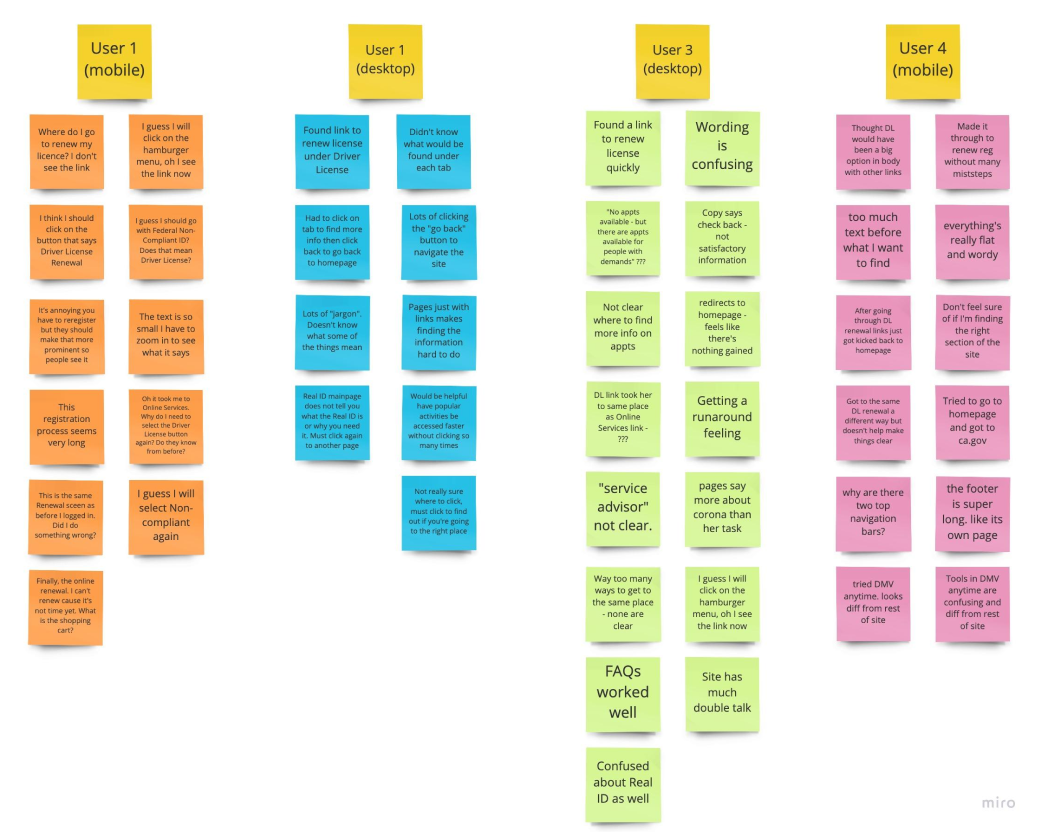
Card Sorting
With pages filled with links, a cluttered top navigation and footer, confusing terminology and no visual component of any kind, the DMV was in serious need of a restructuring of their information architecture as well as a rebranding.We began by breaking down the pieces of the website and reorganizing it in a more user-friendly way.
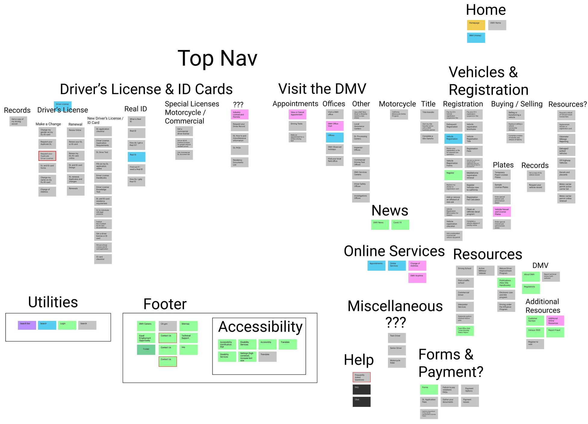
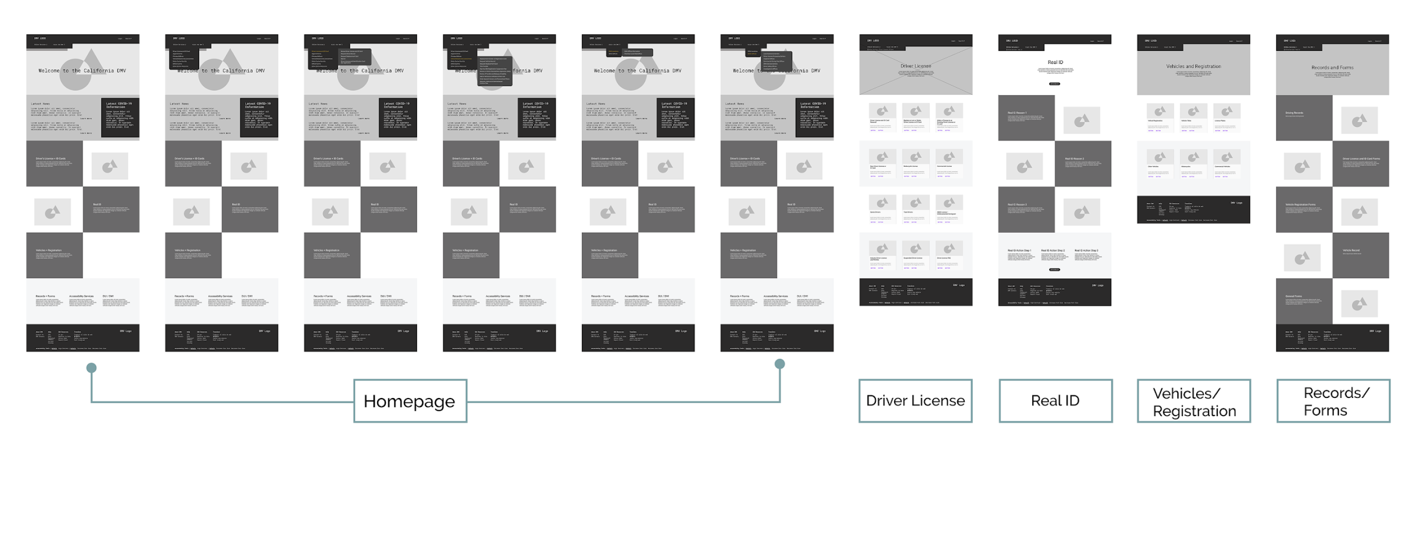
Sitemap Redesign
In our redesign, we simplified the top navigation and the footer to make accessing the site easier. We also labeled new categories and grouped like topics together so that the layout was better organized and centered around user needs.

Ideation
Rebranding & Redesign
Brand Prism
The DMV was in need of a new brand. The previous site felt halfway between institutional and stock. The colors were friendly but not modern and the whole flow felt stale. We began our rebranding with a Brand Prism to start us off on how we wanted to project the new and improved California DMV.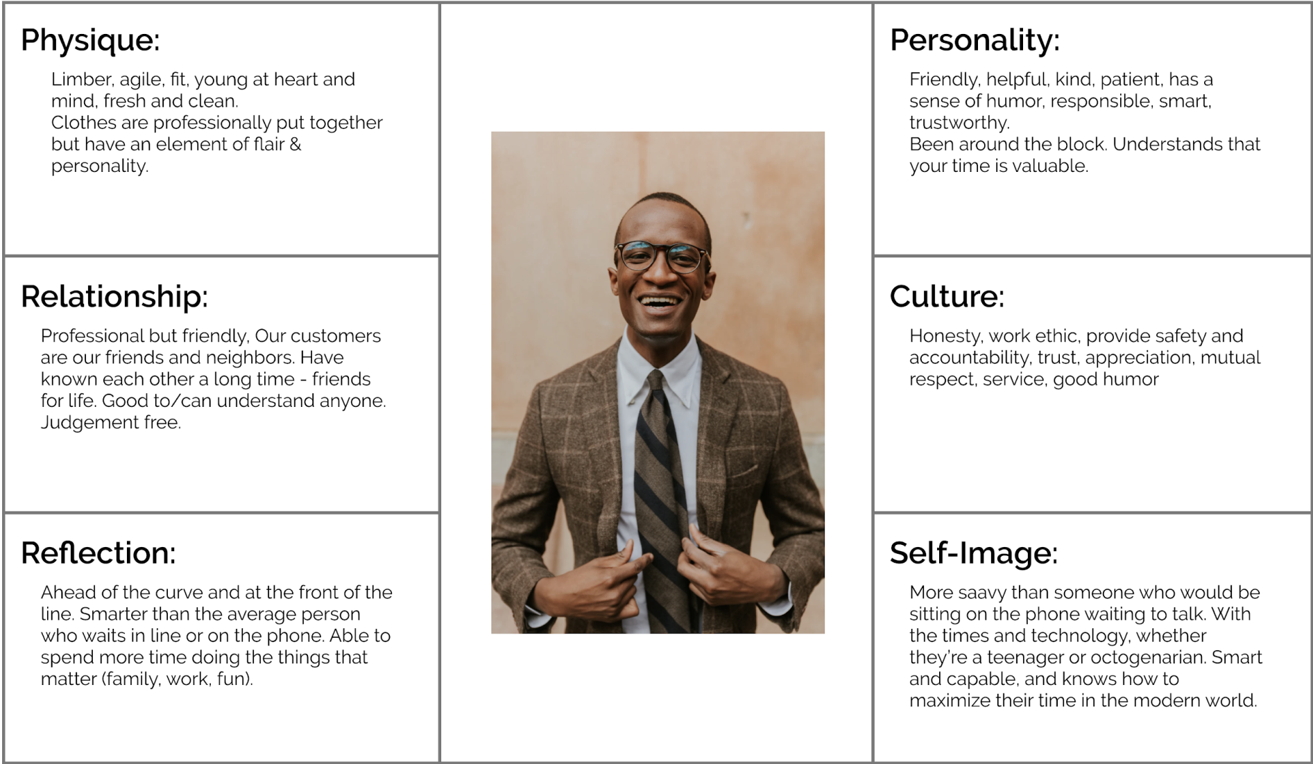
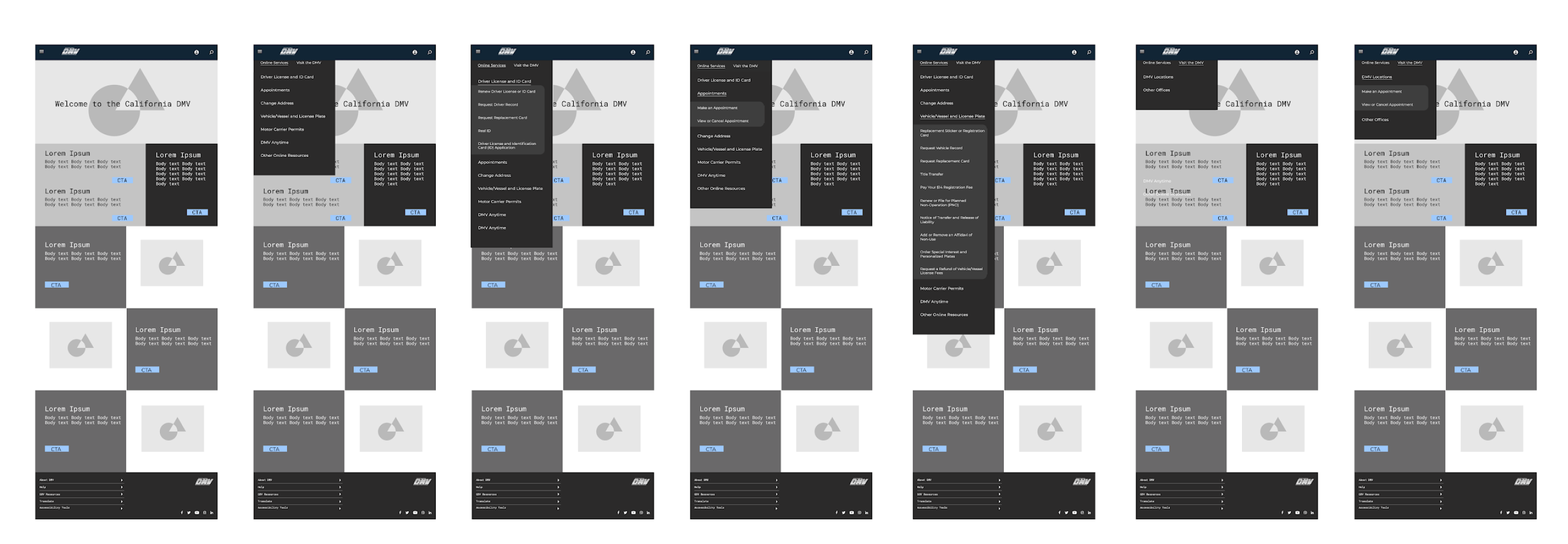
Desktop Navigation Redesign
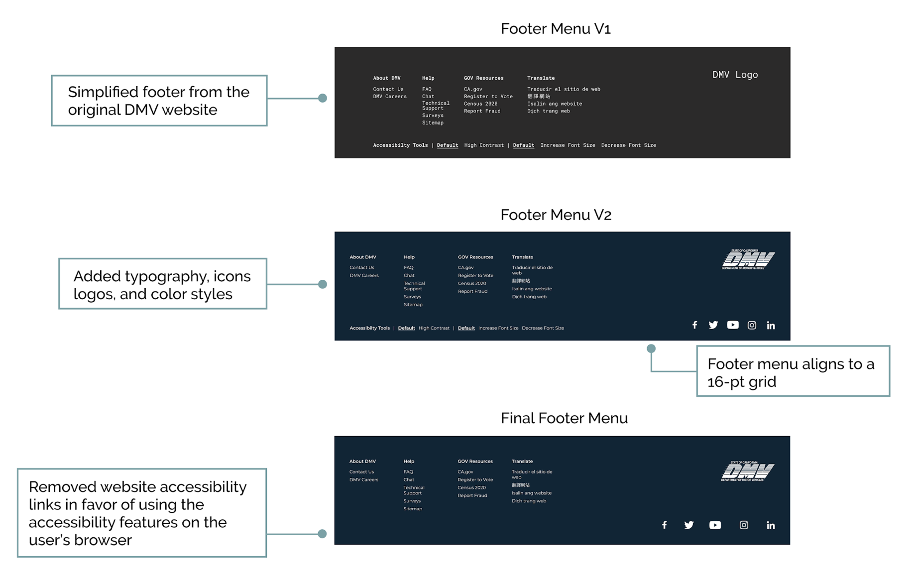
Footer Redesign Iterations
Desktop, Tablet, & Mobile Wireframes

Style Guide
